Phase 2 of a two-phase project encompassing retail and website redesign to bring Singapore’s oldest tea brand closer to younger audiences through storytelling, sensory curation, and an intuitive online storefront.
Following the first phase of research and service design, I was engaged to lead the website redesign for a heritage tea brand undergoing a broader refresh. While the in-store experience offered sensorial exploration and staff guidance, the existing website fell short in supporting discovery, gift curation, and communicating the brand’s depth and craft. The digital experience needed to feel more intuitive, lifestyle-driven, and visually aligned with the brand’s values.

translate the brand’s in-store experience into a modern e-commerce website for tea discovery and appreciation?
/tl;dr
/process
To guide the redesign, I began with a quantitative review of existing site performance, supported by basic desk research to benchmark against e-commerce industry averages. Key gaps in the customer journey, including low conversion rates and high cart abandonment, were visualized to identify opportunities for improvement.
I mapped out a typical e-commerce journey drawing from personas from Phase 1 and supplementing with a bit of auto-ethnography (including ordering from the site myself to experience the flow firsthand).
This was followed by a comprehensive UX audit of the live site to identify friction points in navigation, product hierarchy, and storytelling. The findings were synthesized into design opportunities, which I translated into a restructured sitemap and flow aimed at improving clarity, decision-making, and digital storytelling.
/research methods
Low conversion and unclear user intent
Low conversion rate compared to industry average for e-commerce sites in F&B (6.11%), Consumer goods (3.01%), Luxury & jewelry (1.19%) (Source: Oberlo)
Despite strong branded traffic via Google Search and direct links, the site struggled with low conversion. A significant drop-off was observed between product views and checkout completion, pointing to friction in the discovery and decision-making stages. This highlighted the need to better distinguish e-commerce from informational visitors and clarify pathways to purchase.
High-intent customers blocked at checkout

Overall cart abandonment rate on the higher end of industry average (70.19% - 82%) (Source: Statista)
83% of users who added to cart failed to complete their purchase — a cart abandonment rate exceeding industry norms. The most critical drop-off occurred at the checkout stage, indicating potential usability issues and hesitation. This informed a simplified, trust-building redesign of the checkout flow.
Mapping customer behavior across the digital tea journey
This journey map outlines the typical flow from brand awareness through to post-purchase advocacy, covering both casual browsers and high-intent buyers. Opportunities were identified at key stages — including homepage curation, decision-making support, and post-purchase engagement — to better guide customers and build loyalty.
/insights
UX audit walkthrough
This animated UX audit presents key usability issues identified in the original website — from information overload and inconsistent product hierarchy to unclear guidance for new customers. These findings shaped the redesign strategy, particularly in streamlining navigation, enhancing visual clarity, and better supporting different user intents across the tea discovery journey.
/design intervention
To translate 1872’s sensorial brand story into a seamless online experience, we redesigned the e-commerce site to better support tea discovery, product understanding, and brand trust. The new design introduces six key features that address pain points uncovered in the UX audit and customer journey mapping.
Scrolling homepage
that organically tells the brand story while guiding product exploration
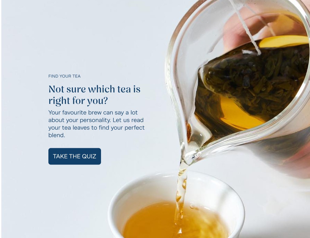
Interactive tea quiz
to recommend blends based on user preferences and moods
Action-based navigation
that directs users by intent, not just product hierarchy
Revamped tea categories
for clearer, more intuitive filtering and discovery
Visualising tea know-how
simplifying complex information into easy-to-understand formats
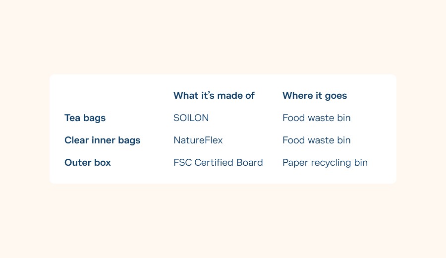
Integrated sustainability and origin cues
on every product page to build transparency and trust
/conclusion
The redesigned website has been handed over to the client’s developers and is currently under development. The final design successfully translates 1872’s refreshed brand identity into a clear, engaging online experience — supporting product discovery, storytelling, and ease of navigation. Implementation is in progress across the full design scope.
Check out the prototype!